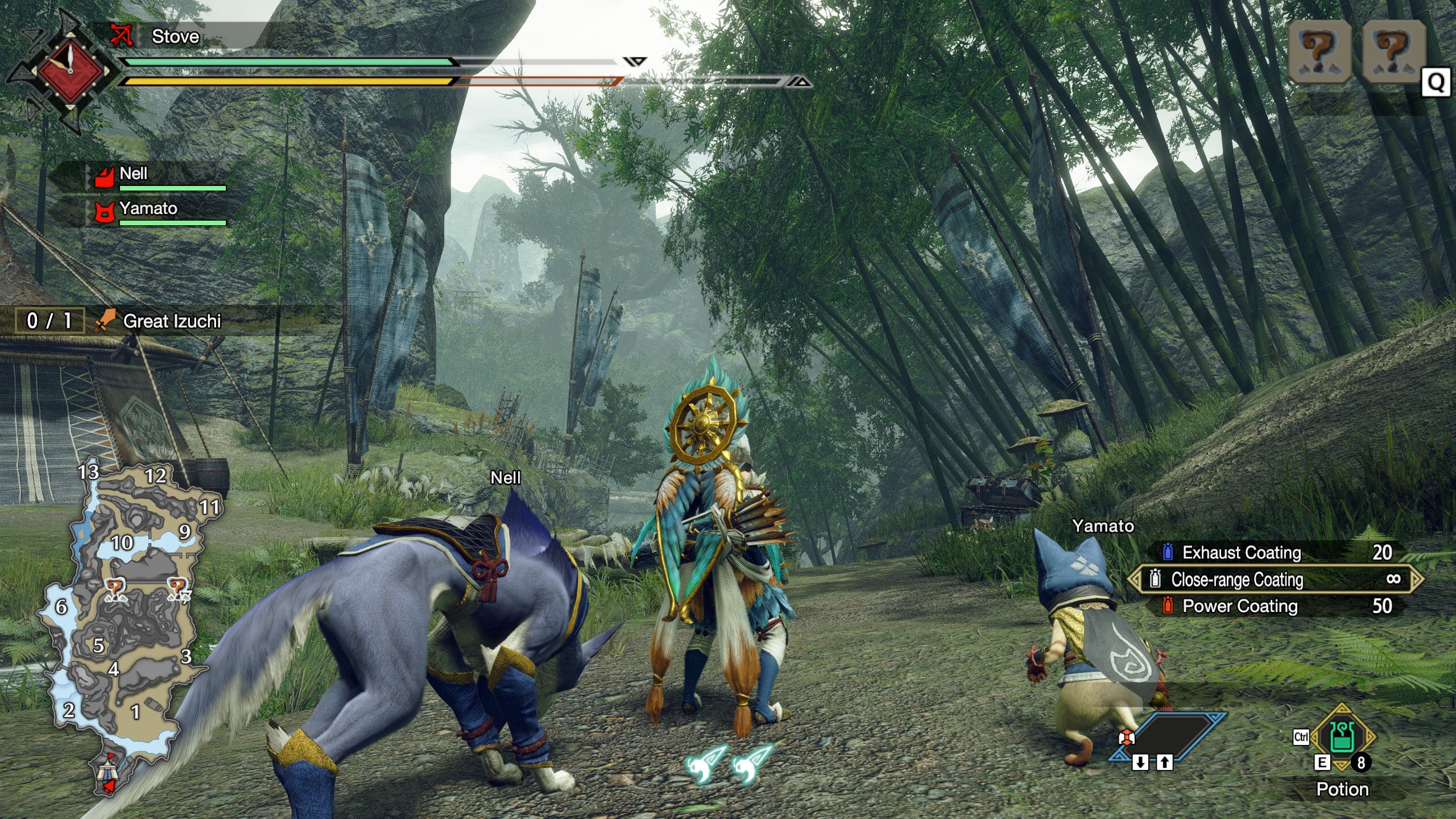
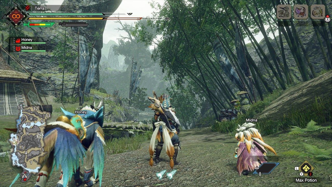
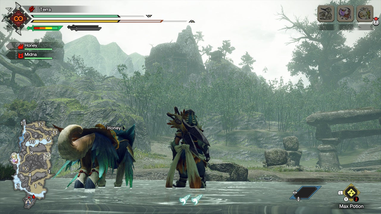
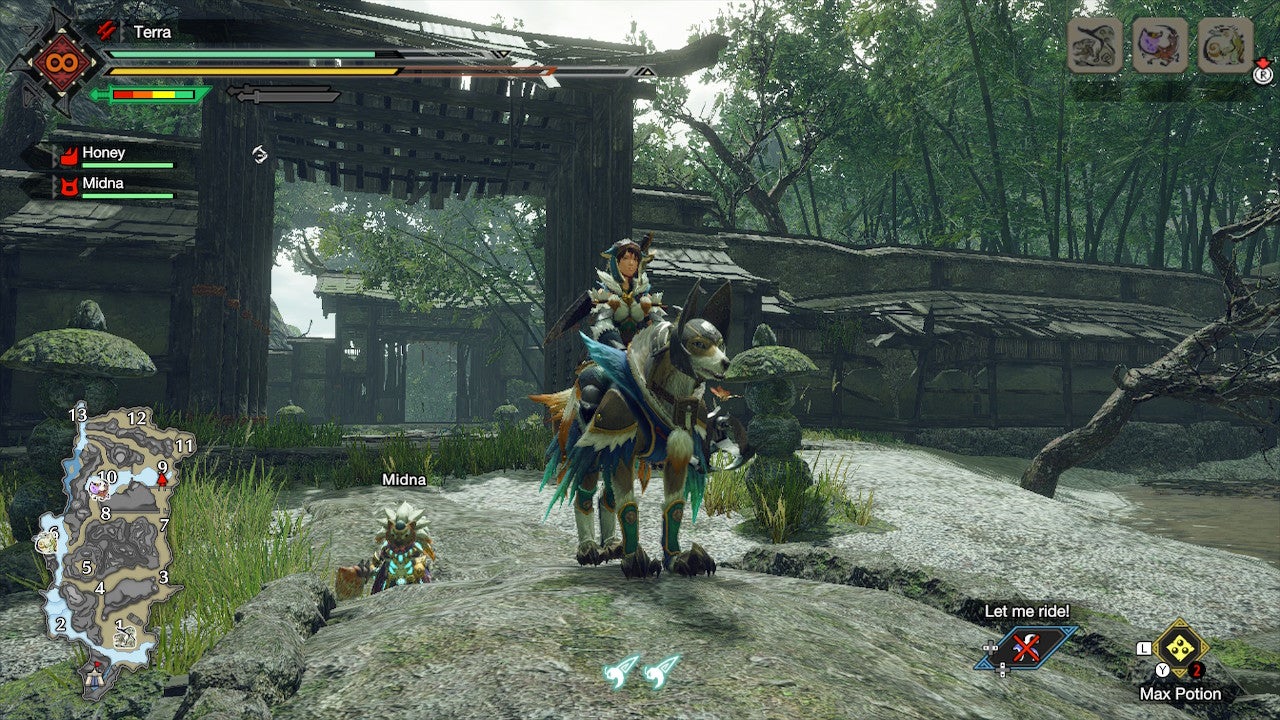
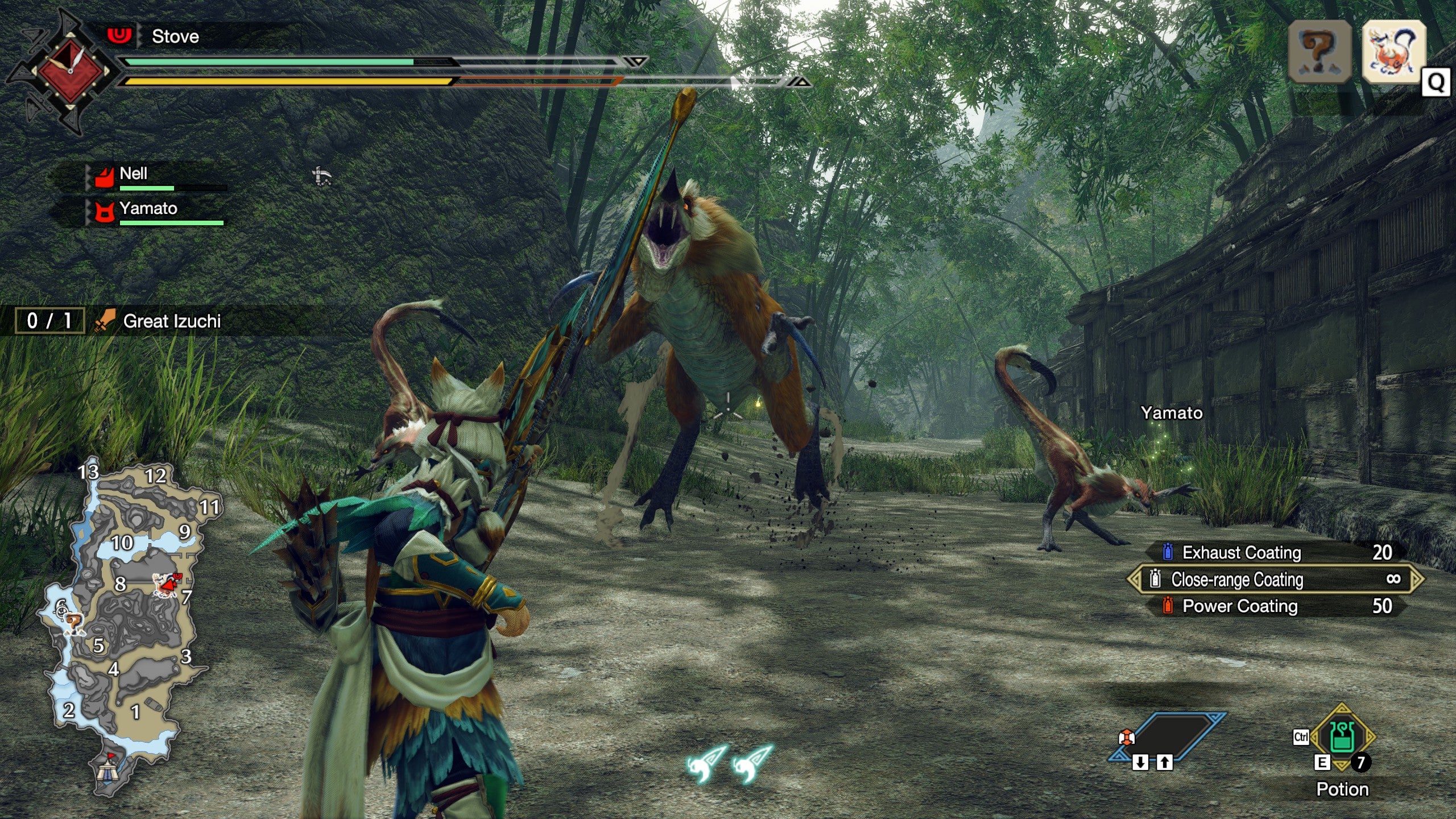
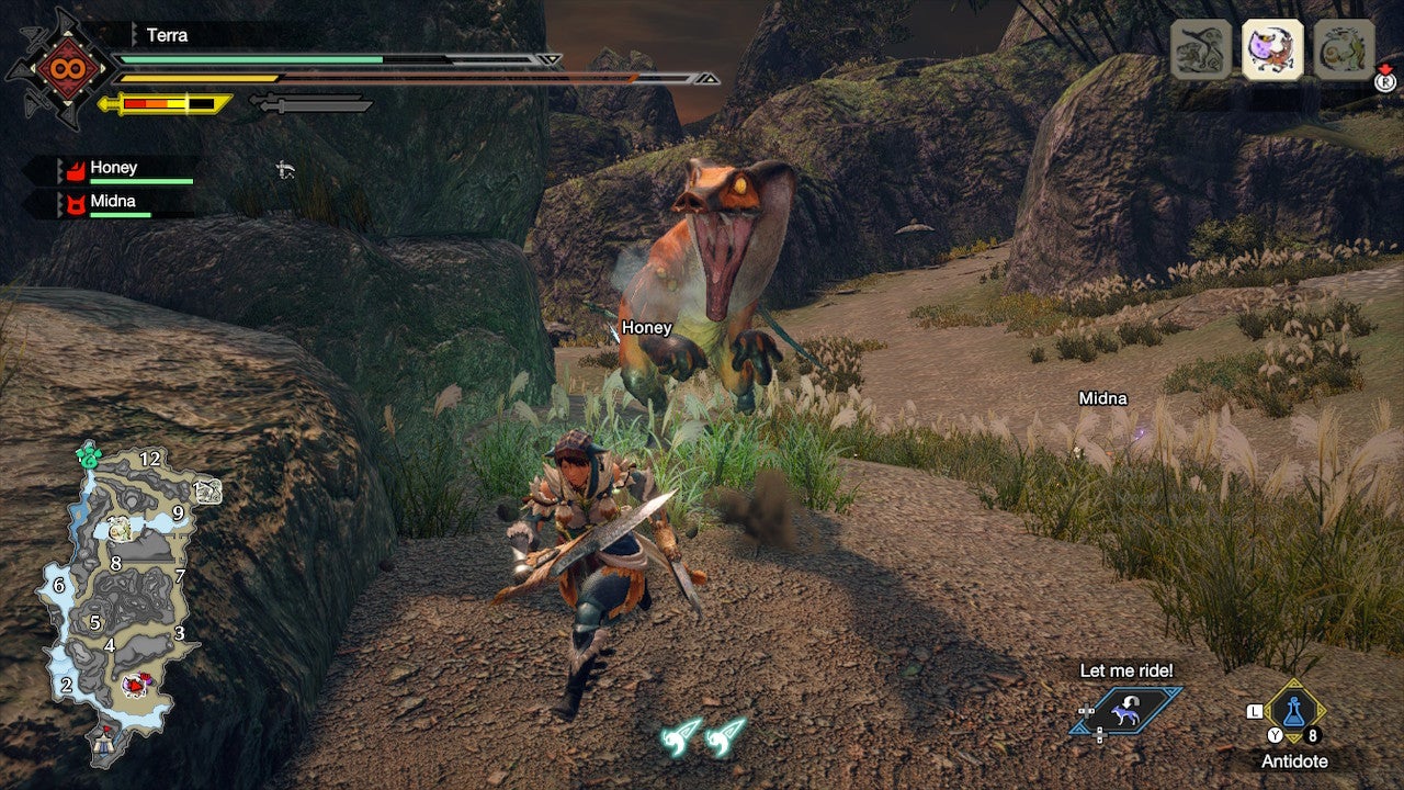
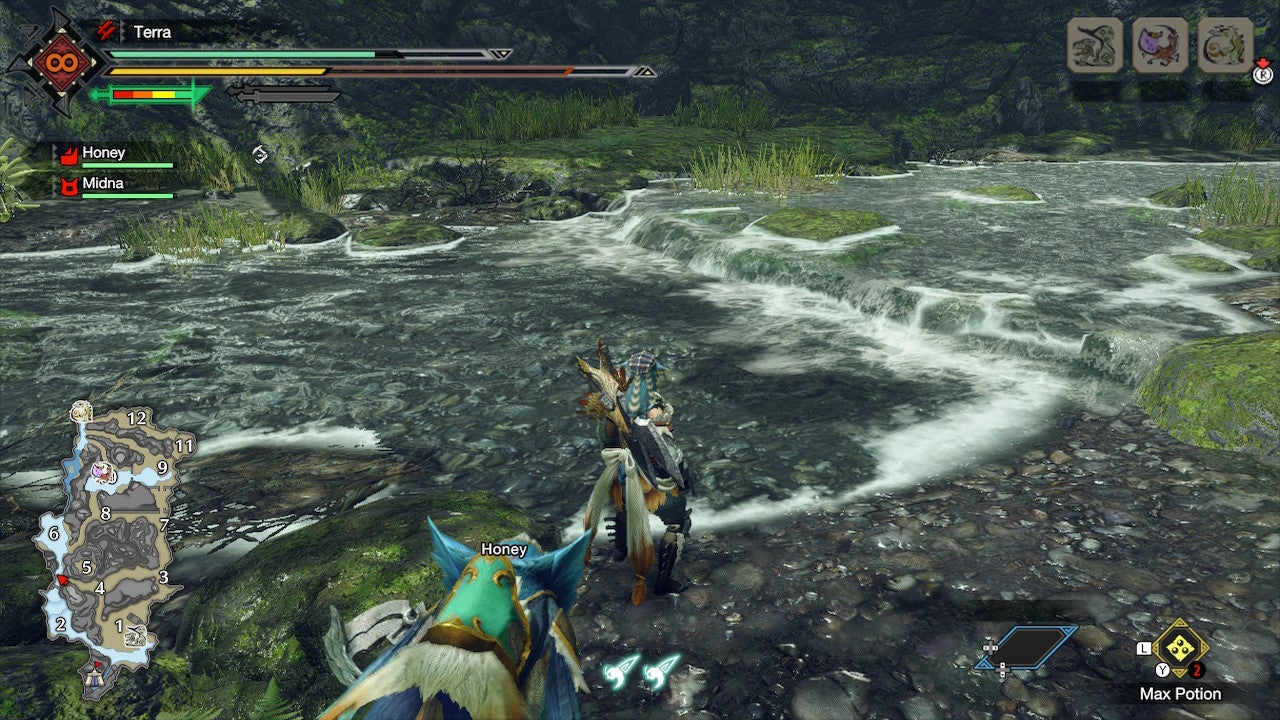
Not to smack talk the Switch, but there’s definitely still a whiff of the low-power handheld console about Rise’s visuals. While the demo is naturally limited to a single hunting ground, there’s nowhere in it that’s as richly detailed as the lands of Monster Hunter World. That said, Rise is quite aesthetically strong, which could be enough to carry it – especially since the PC demo includes what we can assume are the final version’s technical upgrades, including support for monitor resolutions up to 4K and the option to unlock the framerate. Join me, then, as I take my powersliding palamute out into the wilds in search of giant lizard skins and gravel texture comparisons. And before any (considerably more seasoned) Monster Hunter players point it out: yes, I was playing on a keyboard, and yes, this was a mistake. Not an enthusing start for the PC demo, as its main menu is slathered with only slightly fewer ounces of Vaseline than the Switch version. Fortunately, the differences are about to get an awful lot starker. Now we’re talking. Playing at 1440p makes for as gigantic a change as you’d expect, though even 1080p would be a big step up from the Switch version’s maximum 1344×756 in handheld mode (all the screenshots here were taken while docked – handheld mode drops Rise to a paltry 960×540). This extra sharpness grants a better view of the generally upgraded shadows and lighting, the former ditching its unnaturally hard edges and the latter looking much more lifelike too. Access to higher resolutions also clears up details that are much harder to make out on the Switch. Take the cliffside fencing on the centre-left, just above Nell the palamute: clear as day on PC, complete with visible differences in wood textures, whereas they’re all just a grey mess on Switch. Further afield, the PC version benefits from a greater draw distance on other environmental objects. Look for the distant cliff, between the two sets of blue banners: there’s a shrine and some extra foliage that doesn’t appear at all on the Switch. Vegetation in general looks far better too, with more detail and richer shades of green. Again, here we can see how subtle improvements to Rise’s long-range detailing makes the world richer and more verdant. There are more fence posts and shrubs along the distant cliffside path, details that the Switch version omits, and the thicker, greener trees make themselves look a lot less prop-like. There are still plenty of bare patches on the ground, and the forest doesn’t actually get denser, but the improvement is there. While the PC version isn’t a complete graphical overhaul, it does include new high-resolution textures, and both these and character/monster models simply look better. Even the otherwise ho-hum ground textures look much more detailed than on the Switch, where they fade away into outright blurriness just a few feet away from the camera. There’s room for improvement, though. My noble mount has decent fur detailing but also some remarkably rhombus-shaped paws, and while it’s not visible in this particular screenshot, there are a few areas that fail to effectively disguise the use of a repeating, tessellated ground texture. Ah, here’s a familiar sight: thrusting maws and health bar that’s not long for this world. In the heat of doing some actual monster hunting, the PC version’s visual tune-up won’t provide any more of an advantage than higher-quality textures will. Even so, the uncapped frame rate is always nice to have during battles, and depending on your resolution it might be easier to make out the cuts and other damage that Rise (like previous Monster Hunter instalments) uses to convey monster health instead of an HP bar. Then again, even ranged combat gets quite up close and personal, so this isn’t necessarily an issue on the Switch that needed fixing. This PC shot also shows the fuzzy, out-of-focus effect that’s prevalent on cloth, feather, hair, and fur textures when using temporal anti-aliasing (TAA). This remains even if combined with FXAA, so leave it on FXAA only if the effect distracts you. The PC version’s water effects won’t have anyone cooing. Still, there’s no denying the drink looks much more water-like than on the Switch. Here we can see it darkening and refracting our view of the riverbed much more convincingly, a quality that also highlights the contrast between the flowing river and the soaked but solid ground besides it. Ultimately, the Monster Hunter Rise PC demo doesn’t make an entirely clean break from its handheld past – maybe that makes it an ideal Steam Deck game? – but in fairness, this is only a preview, and the full PC version will launch only nine and a half months after the Switch original. That’s hardly much time for a top-to-bottom remake, and there are enough additions and improvements here to at least encourage PC owners. Not just the unlocked frame rate and higher-res textures, either: there’s ultrawide monitor support and a full set of customisable quality settings. No, maxing these out will not blind the angels with its splendiferousness. But for something that started life running at sub-Full HD resolutions, it’s a respectable effort so far.
